

Numbers to decide with, not to decorate.
How long a task takes, where it gets stuck, how much the team delivers per cycle and how time spent compares with the estimate — without anyone building a spreadsheet on Friday night.
Indicators that change a decision
Everyone already has a pretty, useless report. These answer questions that come up every week in the meeting.
Where work gets stuck
Cumulative flow, lead time and cycle time show the queue growing before it turns into delay.
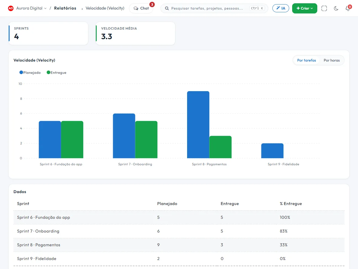
How much the team delivers
Burndown for any filter, velocity and sprint report, so the next promise comes from history.
Time spent
Logged hours, estimated vs. actual and productivity per person, project or period.
Aggregated dashboards
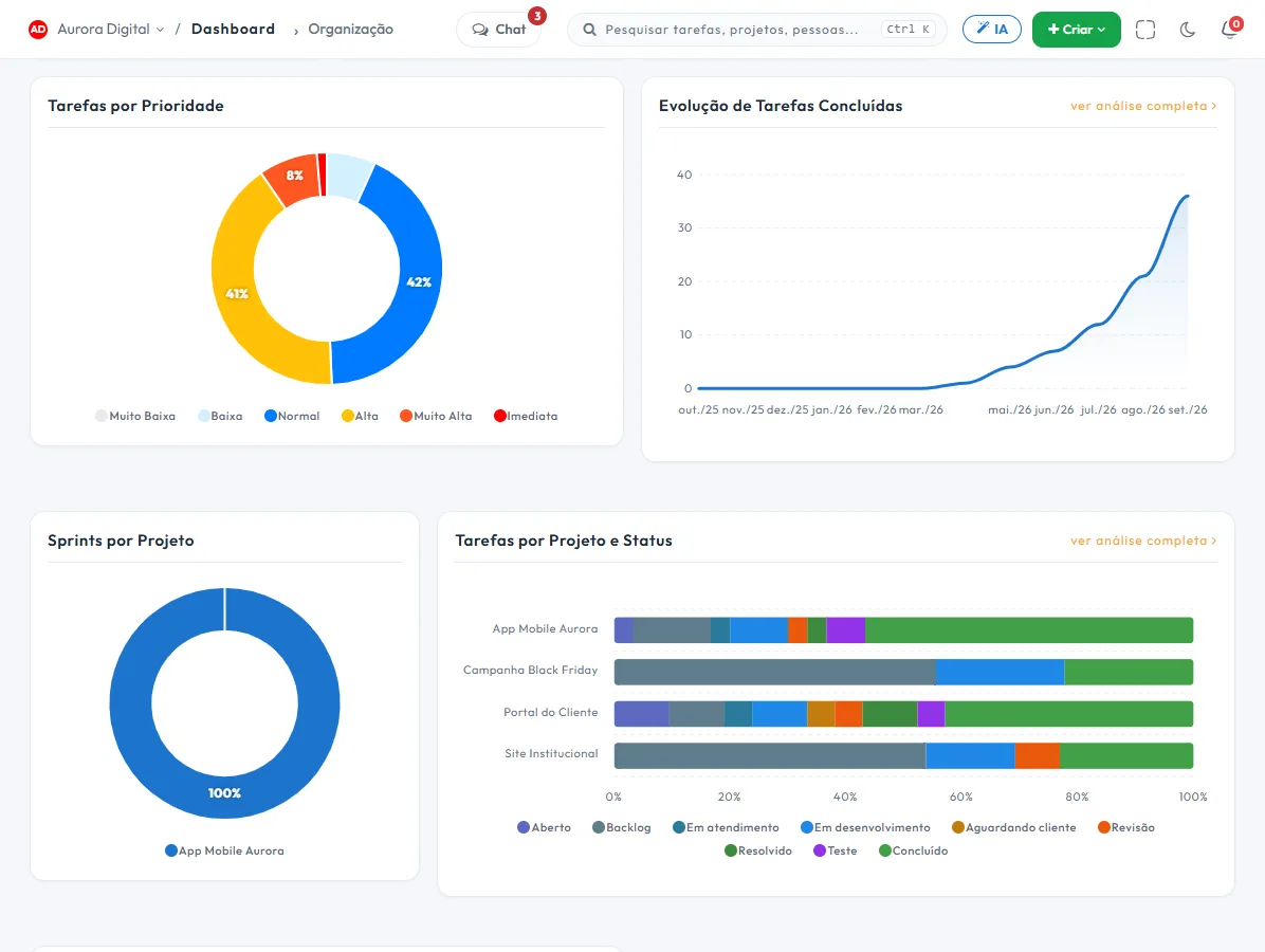
Portfolio, team, organization and support on one screen, with projects at risk and load per person.
The health of everything that is open, on one screen
When there are twenty projects, the question isn't "how is project X doing" but "which ones are at risk". The dashboard starts there.
- Late, at-risk and on-track projects, with the owner of each
- Load per person, to redistribute before someone burns out
- Organization delivery trend, month by month
- Support dashboard with volume and response deadlines
This lives alongside the rest of the operation
Task, schedule, ticket, goal, and conversation are the same database. What changes in one place shows up in the other, with nothing to export.
How to use reports and dashboards in the follow-up meeting
A report is only worth it if it changes a decision. The simplest way to start is to tie each report to a question that comes up every week in the meeting. The numbers are fed by day-to-day work (statuses, dates, sprints, tickets and logged hours), so there's nothing to configure: just use Tasskee.
Step by step to build the routine
- List the meeting's questions. "What's overdue?", "Who's overloaded?", "How much did we deliver this cycle?", "Are we spending more hours than planned?".
- Link each question to a report. See the table below.
- Start with the portfolio dashboard. It shows, on one screen, which projects are late, at risk or on track, with the owner of each.
- Drill into the report only for what caught your eye. The dashboard tells you where to look; the report explains why.
- Record the decision in the task. If the number revealed a problem, the outcome of the meeting is a task with an owner and a due date, not a loose comment.
- Repeat every week, with the same script. Comparing with the previous cycle is where the report pays off.
Which report answers which question
| Meeting question | Where to look |
|---|---|
| Where is work piling up? | Cumulative flow |
| How long does a task take from request to delivery? | Lead time and cycle time (see time in status) |
| Will we make the sprint? | Burndown and sprint report (see sprints) |
| How much does the team deliver per cycle? | Velocity |
| Are the estimates realistic? | Estimated vs. actual |
| Who has too much load? | Team dashboard and workload per person |
| Is support meeting its deadlines? | Support dashboard and ticket reports |
Examples by type of company
Marketing agency in Porto Alegre
The partner opens the portfolio dashboard on Monday. Two client projects show up as at risk. She drills into the hours report and sees that the logged hours went over the estimate on both. The meeting's decision: renegotiate the scope of one and reinforce the other. For the financial side, see hours, invoicing and payment.
Building maintenance company in Campinas
The operations manager tracks the support dashboard: ticket volume and response deadlines. When the deadline starts to slip in a category, he redistributes before the complaint arrives. Tickets and the queue with deadlines feed this dashboard.
Software house in Florianópolis
The lead uses velocity and burndown to commit to the next sprint based on history, not optimism. The estimated vs. actual report calibrates the next round of estimates.
Best practices
- One report, one question. If nobody knows which decision the number supports, take it off the agenda.
- Keep statuses honest. A flow report is only as good as the discipline of moving the card when the work changes phase.
- Consistent time logging. Without logged time, there's no estimated vs. actual.
- Compare equal periods. One cycle against the previous one, not a short month against a long one.
- Show the dashboard, not the pre-packaged version. People who see the number in the system trust it more than a slide put together the night before.
Common mistakes
- Looking at the average when one forgotten task distorts everything. Prefer the median and percentiles.
- Holding the team accountable for the number instead of investigating the process that produces it.
- Building a parallel spreadsheet because "the report doesn't add up". Almost always the problem is the source data, and the fix should happen there.
- Drawing conclusions from a small sample, like a project with only a few tasks.
A 20-minute script for the meeting
Open the portfolio dashboard and spend five minutes on the projects at risk. Spend another five on the workload per person, redistributing whatever's needed on the spot. Dedicate five to the cycle report, like velocity or flow, and the last five to recording the decisions made as tasks. A follow-up meeting that ends with tasks created, each with an owner and a due date, usually lasts less and delivers more than one that ends in "let's look into that".
Plans and export
Start includes 6 basic reports. Pro has all 19 reports and the aggregated portfolio, team, organization and support dashboards. To take data to another system, the REST API and webhooks are available from Start.
Want a ready-made format for the weekly conversation? Use the weekly status report template. And if the meeting is about goals, the dashboards work together with goals and OKRs. Try Pro for 15 days, no card required, and see your team's numbers without building a spreadsheet.
Questions about reports
Do I need to set up a report?
Can I export it?
What is the difference between a report and a dashboard?
Start the meeting with facts, not opinions
Try Pro for 15 days and see your team's numbers without building a spreadsheet.